
[We’re happy to bring you part one of an interview with Andrew Bell about his design of the A-Type platform figure which will be released shortly from mphlabs. The interview includes Andrew’s video introduction of A-Type. Don’t miss Part 2 over at myplasticheart.]
Q: Hi Andrew. How did A-Type happen ? Had you planned from the beginning to include the mph heart logo into the design ?
I’ve known Vin from MPH for years, when we first met we were both still working full time and just getting into toys as a fun aside. A few years later, we’re both working for ourselves, and toys are a major part of our careers. He’s always been fun to work with, and we’ve always wanted to work on something together, so the A-Type project was a natural fit. It’s hard to believe, but we planted the seeds of this project almost four years ago. We’ve both been so incredibly busy on our own that it’s been hard to focus on a joint project, luckily we were finally able to get it together!
The inclusion of the logo was always a goal of mine. It’s simple, yet strong, and a globally recognizable shape.
Q: A-Type. What's in a Name? 'A' shaped, 'A'ndrew Type ? Were any other names kicked around ?
The name is a little bit of everything really! The figure makes a bit of an A shape, my name starts with an A, but primarily it’s a reference to the heart shape, specifically blood types. We kicked around a few other names, most with a heart theme. They included “coronary”, “bypass”, “heartsy”, “bpm”, and the close but not quite “Type A”. I think we made the right choice!
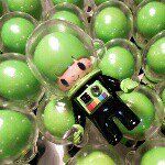
 A-Type Design Variations
Q: From the outside looking in, designing a good platform appears to be rather hard. Did your experiences working on platforms designed by others come into play for A-Type ? What were some of the challenges with A-Type?
I shied away from working on platforms for several years because I felt as if they weren’t really going to help me be a better “toy designer”. When I eventually did a few designs on other people’s forms I came to appreciate them for what they really should be, a starting point. They are a blank canvas. You can just paint right on that canvas, or you can make that canvas your own! You can cut it up, add things to it, turn it upside down. The approach I took when given a platform or a blank toy to customize definitely played into my design for the A-Type. I wanted it to be a solid base, without being too generic, but with a huge number of possibilities.
We faced quite a few challenges, the biggest being trying to realize the vision of the solid seamless heart body shape. We tried all sorts of materials, processes and constructions before we finally got the shape, balance and construction just right.
Q: A-Type is a very clever design in part because the figure can be displayed resting on it's hands or inverted with its arms above it. Also, the curved hands allow it to hang suspended from a wire or such. Were all these aspects planned in advance or happy discoveries/what-if's as the design progressed?
The design was a result of designing through several iterations, adding a new idea here and there to see how they would work. Older sketches have the hands and bottom of the heart on the same level, then the arms got a little longer, and finally I thought curving the hands a bit at the ends would add another fun element and expand display potential.
[Thanks for reading Part 1. Head on over to myplasticheart for Part 2]


