1. Tell us about Chris Lee.
I’m a 23 year-old
designer and illustrator from Sacramento California (born and raised).
I currently attend Sacramento State University where I’m impatiently
trying to finish my BS in graphic design but luckily I’ll be graduating
next Spring. After four and a half years working as the lead designer
for a design firm in Sacramento (doing mostly print work), I decided to
leave and start my own freelancing business and it is call The Beast Is
Back.
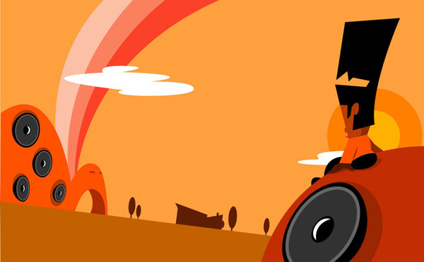
2. Chris Lee’s design style can be best described as:…
A clean, colorful cotton candy stall
3. Which other artists and bits of pop culture have influenced your design style?
I think my influence has come from a gradual
synthesis between my design and illustration backgrounds. I’m a big
typography, color-theory, and white-space junkie (yes, I’m a design
nerd). Graphic design has played a crucial role in helping me
understand and implement Gestalt principles in my illustration work.
For graphic design, my influences have basically been contemporary
design culture (i.e. experimental type, sneakers, furniture, product
design, edgy magazines, etc). I’ve always found magazines to be my
window to the newest design trends. I usually look at the layouts
before I look at the content. For illustration, I’d have to say any
artist that uses composition effectively. Those pieces grab my
attention more than anything.
4. Do you collect toys? If so, what are you collecting right now? Best toy ever?
Definitely. Before I started buying vinyl, I
collected a ton of Star Wars figures (circa 1995 +) and all of
McFarlene’s figures. I’m also a huge Godzilla fan and love the stuff
Bandai Japan has done with the license. But I’ve always been an
action-figure nut since I was kid. Thanks to a mom who supported the
habit back then.
The Best toy ever? Well, that’s a tough one
since that category is so subjective. For me the best toy(s) ever were
the massive Inhumanoids figures from the 80’s. Meltar and Decompose
were kings! Okay, maybe there’s someone out there that remembers them
as well as I do.
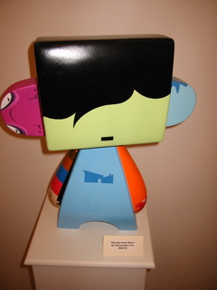
5. My first encounter of your art was at the Mad*l show where I
saw your 20 inch “The Boy Next Door”. I loved the clean lines design,
which was enhanced by a simple wonderful color scheme. What went into
designing that piece? How long did it take you? What kind of medium did
you use and where is now?
The concept for the MAD*L piece came from a
lot of basic graphic design principles, specifically the backbone of
all design… communication. The strongest messages are conveyed with the
least amount of detail. That’s why I’m such a fan of Swiss design. But
I love the power of color because it can say so much using so little. I
think that’s what has helped my Urbanites series become so accessible
to such a broad audience… their color schemes help evoke emotion. I
borrowed a lot of the color palette for the MAD*L directly from the
Urbanites (as well as using direct character references on the piece
itself. The whole thing took about 4 weeks to complete. Mostly due to
trying to figure out how to get the cleanest lines possible. I used
Montana brand spray paint for the pale green face and hair and standard
acrylic for the rest of the figure. The figure is still unsold and
presently is with Wheaty Wheat .
6. On your website, www.thebeastisback.com
are a series of photographs. Tell us more about them. How did you make
that transition from producing 2D photographs to 3D toy art?
Photography is just a hobby of mine. Recently,
I’ve begun to collect vintage cameras and experimenting with
alternative camera types (like the SMENA Symbol and the Polaroid
SX-70). Other than that, I have very willing (and luckily photogenic)
friends to help with my sometimes on-the-fly photo shoots. The line
between my photography experiments and developing toys is very defined.
They really don’t have anything to do with each other. If anything, the
photos I take are just another way for me to exercise composition,
light, and color.
7. Who and what are the Urbanites? What was the creative process
behind them? Are they going to be transformed into toys? Or are they
mostly 2D characters
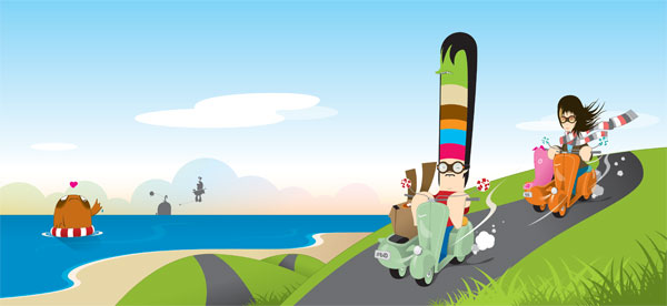
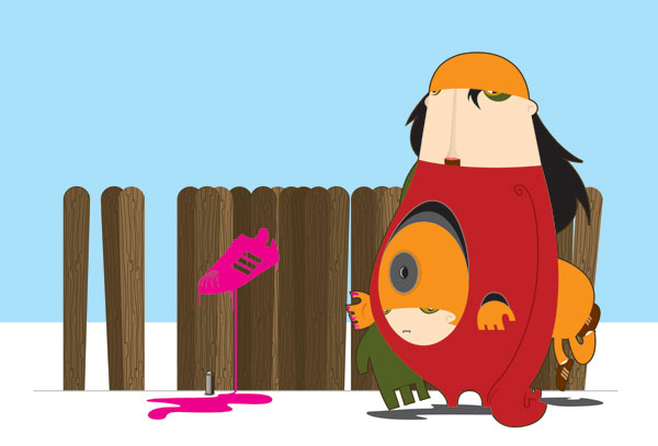
The Urbanites are just your average neighbors.
Populated together in that close-knit community you’ve come to love and
hate… filled with best friends, mortal enemies, love, summer
popsicles, fresh cut lawn, and daily insanity.
They are just like
you and I…almost. The majority of the characters have individual
stories and conflict. In the beginning, I wanted the characters to
exhibit a lot of substance with minimal detail. To accomplish this, I
decided to use basic shapes (circles, triangles, rectangles, etc) to
give each of them their personality. The Urbanites are another example
of how I like to blend the line between design and illustration. Each
character was sketched out and then taken into Illustrator. The vinyl
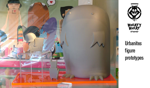
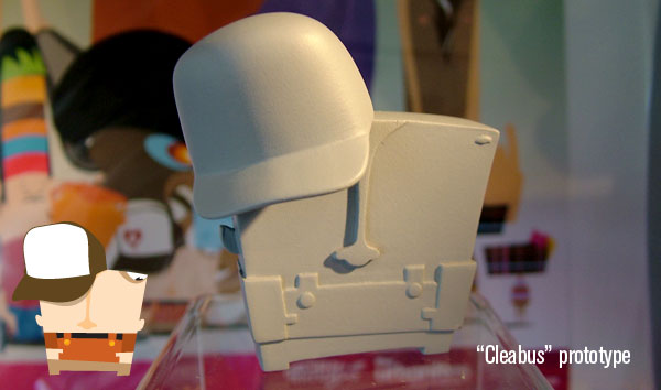
figure line is being produced by Wheaty Wheat Studios and will be
available sometime early next year. The painted prototypes of some of
the characters will be at the San Diego Comic Con this year.
8. You have a unique relationship with Wheaty Wheat Studios. How did that come about?
I first met Richard VanOver while
participating in a group show at Blue Space in Hollywood. The show was
called ‘Art Throb’ and was sponsored by Cannibal Flower. I was invited
by Joe Ledbetter to show some of my giclee Urbanites prints and so I
jumped at the opportunity to show in L.A. (albeit a small show). But as
far as how our relationship got started, it was more of I was just in
the right place at the right time. He loved my work and offered to
license my character designs to turn into a vinyl figure line.
9. Who would you most like to collaborate with on a toy
project? Also on that note, what toy "canvas" would you most like to
produce a design for?
I would love to collaborate with TADO, but I
would probably have a Wayne’s World flashback and cry out “I’m not
worthy!” I love their style and the promiscuity they present through
their cute and dangerous monsters. The toy canvas I’d like to produce a
design for would have to be a Be@rbrick. I have a lot of them and just
love the quality and the following they have (not to mention their
shape).
10. What’s the biggest challenge of making and working on "designer toys" ?
The biggest challenge I’ve face is having to
see my characters in a three-dimensional space. Before, my characters
were merely graphic symbols, almost logo like due to their simplicity
and then, all of a sudden I had to create 3 and 4 point turnarounds for
modeling reference. There were new things I had to consider like
consistency, size relation, and balance; things I never thought about
before. So in the end, the challenge actually lent itself to be not
only a learning experience about the process of starting a figure
prototype, but it also allowed myself to evolve my characters into
something more dynamic.
11. What’s next? Care to shed some light on any new upcoming projects?
Currently, I’m doing the illustrations for a
to-be-published children’s book entitled “Theo” and I’m trying to work
out an animation deal with the Disney Channel (which is still a big
work in progress).


Cool stuff I’m a fan already! 😀
Really looking forward to that huge hairy figure especially, don’t make him too expensive, you guys at Wheaty Wheat have taken all my money already! 😀
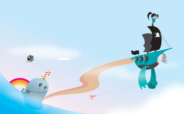
Love that flying pirate ship, hope you are going to do a print of it!
And thanks to VP for another marvellous interview 🙂
wow, really nice and crisp art stytle….quite abstract characters too…i like a lot…
excellent news site too 🙂
wayne
ploom2.com