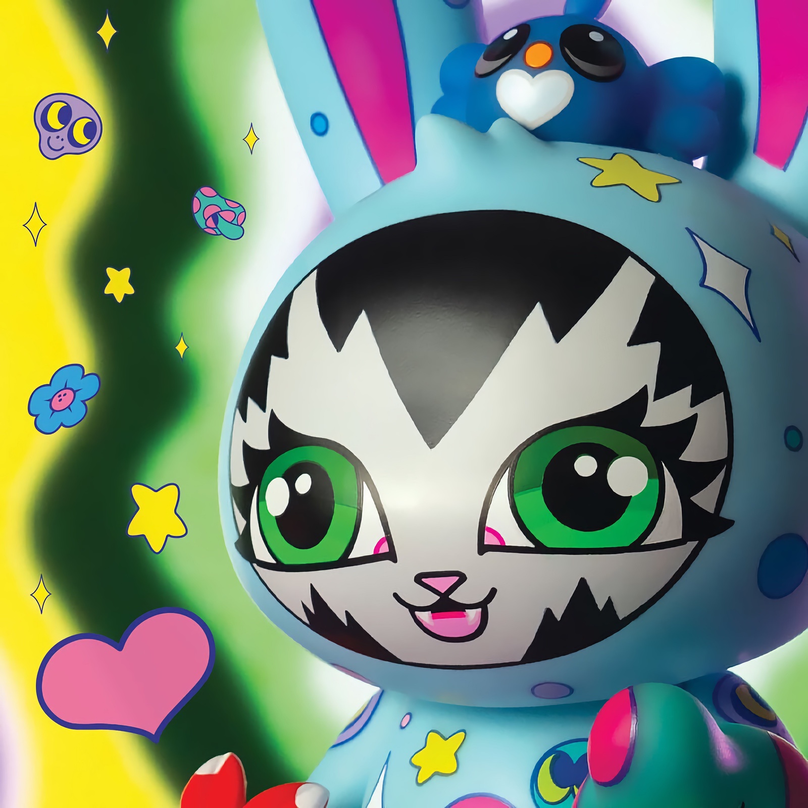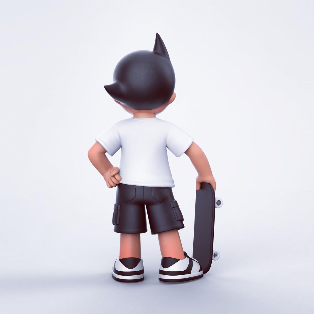
Over the past few months, we’ve brought you an exclusive behind-the-scenes look at the development of Julie West’s first original vinyl figures – Bumble and Tweet, in production from STRANGEco. We’ve done Turnaround drawings, sculpts, and today we’re finally moving into color – with a first look at the three colorway pairings –Spring (above), Candy and Tree (after the jump) — chosen for the production figures. Let’s start with Julie West’s take on the process of creating colorways.
Working with color is always one of my favourite parts of any project. I think that color plays as an important part as the line, texture, composition – and without key color choices or palettes my work would simply not be the same…
That said I really struggled in the beginning trying to decide how to approach the color with Miss Bumble and Tweet. Because they are two figures that go together, I wanted the color to work together as "sets," but also have them differentiated from each other in some way.
For this reason I did a lot of variations of the color. I scrapped a lot and started over a few times… I can’t recall the total number of colorways that I did, but we did have to narrow it down. At different stages I sent them over for feedback and eventually, I ended up with 3 different colorways that I was very happy with.
I wanted to have 3 completely different directions with the color, so I chose to work with different palettes that are recurrent in my work: pinks and reds / earth and nature tones / as well as a subdued neutral range.
Overall, this step took me a lot longer than I expected simply due to all the variables (2 toys with 3 different colors and a lot of tweaking!) but I think it was worth it as I am pleased with what we have selected. I think they work with the toys as well as represent my work. I am excited to see the first printed samples. 🙂
[Gregory Blum (STRANGEco) rounds out our look at the colorways by describing the process of narrowing the choices down to select the production colorways].
Going in, we wanted to present a nice variation of color and design from version to version in order to appeal to different tastes. We also felt it was important for each version to be unique, but complimentary to its mate. Of course, all should be an honest representation of Julie’s style, so we asked her to submit some ideas without setting many guidelines.
After Julie sent us 4 color schemes and a couple of decoration designs, we let her know which best suited our own tastes as well as a few ideas of directions to go in that we felt would be good for variety. Julie continued to refine her designs while creating some new ones, so after a few rounds, the selection and feedback became more difficult due to the sheer number of nice looking designs… at one point I thought we’d have to produce a dozen color-ways! Finally, we settled on 3 matched pairs: green "tree colors" with a simplified bark texture, pink "candy colors" and gray/peach/green "spring colors".
Julie produced another round or two of tweaks for some production issues and to suit her tastes, and we finally had our designs for submissions. Since we had decided to go forward with multiple patterns for each character, we had to remove the pattern’s sculptural elements to allow all the variations to be applied to one set of molds. We are currently awaiting the first round of painted samples to review for aesthetics, as well as to find out whether we need to make some minor adjustments for technical/production issues. We’re really excited to see them, too!


